Like many, I’m suffering from COVID19 burn out. This weekend’s news that more than 200,000 of us have died from the disease was a much-needed kick in the pants; I’ll do better keeping track of news – good and bad – about the pandemic and its impact on us.
To start, kudos to the California Workers’ Compensation Institute for their excellent work tracking the impact of COVID on workers comp in the Golden State. Their interactive tool is here; takeaways from the latest update (for 2020 to the end of August) include:
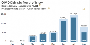
- CWCI projects there will be 48,000 COVID claims incurred through the end of August
- About 13,500 will be denied
- Healthcare will account for about 4 out of ten claims accepted
- Retail and food services will account for about one of every eight claims accepted
- Including both COVID and non-COVID claims, claim counts are down 26% from 2019 levels.
Data
About 200,000 of us have died from COVID19; about one of every fifty of us has tested positive. And the number of infections keeps increasing at a troubling rate, especially in Rocky Mountain states and those just to the East.
Treatment – 2 medications are helping infected patients, a couple more are showing promise, and – once again – hydroxychloroquine is NOT on that list.
Vaccines – 11 are in late stages of testing, and 5 are being used in a limited way (there’s overlap between these two groups)
WorkCompCentral is hosting a free webinar focused on the impact of COVID19 on Florida’s workers’ compensation system and stakeholders. The Registration is here; the webinar is tomorrow, September 29 at noon Pacific, 3 Eastern.
Lots more going on – will keep you posted.
What does this mean for you?
Wear a mask. Properly! over your nose AND mouth.
Thanks to Brad James for the reminder.

Joe, I would add the word, “properly” to “Wear a mask.” I can’t count the number of people wearing a mask below their nose, or better yet, individuals who pull their mask down to their chin when they speak. This completely defeats use of facial coverings..
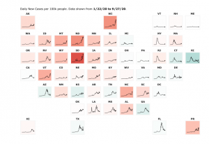
Hi Joe. Something is wrong with your state by state chart above. The title is daily cases per 100k 1/22/20 to 9/27/20. SD and Ri are about the same size and have roughly the same infection rate. What is dramatically different is the death rate in RI is four times that of SD.
SD pop 885k – infections 21,541 rate .024 deaths 218 rate .000246
RI pop 1,056k – infections 24,181 rate .023 deaths 1,107 rate .00105
Hello Tom – thanks for the note and observation.
I’m not sure there is anything wrong with the chart. As you note the chart details the infection rates over time and Rhode Island does have a higher death rate than South Dakota. Those data have been confirmed by other sources; if I’m missing something please let me know.
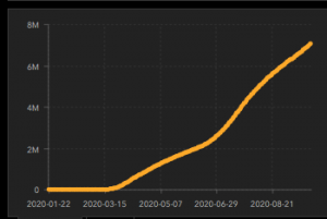
The difference in the death rate is likely an artifact of two things, both driven by timing. Recall RI was hit by the coronavirus much earlier than South Dakota, which just saw it’s infection numbers explode about 5 weeks ago. (see the two charts to compare the current and historical infection rates)
RI’s spike was back at the end of April; SD’s infection rate is still increasing.
https://www.nytimes.com/interactive/2020/us/south-dakota-coronavirus-cases.html
First, medical treatment for COVID patients has gotten much better, with much lower infection fatality rates recently than back in February, March, and April. That’s because we know a lot more about the disease and how to treat it now than we did in the spring. Because SD’s higher infection rates didn’t arrive until mid-late August, those infected received better medical care due to what folks in RI learned back in the spring. As a result, more SD patients survived. (note some research agrees with this, while some disagrees with that assertion – https://www.cebm.net/covid-19/declining-covid-19-case-fatality-rates-across-all-ages-analysis-of-german-data/
https://www.statnews.com/2020/08/24/infection-fatality-rate-shows-covid-19-isnt-getting-less-deadly/)
Second, the infection-to-death timeframe is likely at play. Unfortunately, some folks in SD that just recently got the virus will die; they just haven’t yet. Check back in a month or two and the death rates will converge – somewhat.
more on this here – https://covidtracking.com/blog/why-changing-covid-19-demographics-in-the-us-make-death-trends-harder-to
Finally, there’s another thing – the charts show the 7-day rolling average of REPORTED deaths, not actual deaths. There’s about a one-week lag between death and report of same.
and perhaps one more – the demographics of the infected seem to be changing, and more specifically getting younger. It could be SD’s infected folks are younger, which means much less likely to die.
So, there’s a rolling average which includes data from 7 days ago; the death rate lags behind the infection rate (which has somewhat-shorter lag); and people infected now are getting better care.
Hopefully that all makes sense.
be well – Joe